Exhibition at
Les Clarisses
Location: Arenys de Mar, BarcelonaYear: 2018
Surface: 400 m2
Status: Built
Més description, Team, and Advisors
CLARISSES: PAST, PRESENT AND FUTURE
Musealisation, design and curation of the exhibition organised by the Municipality of Arenys de Mar.
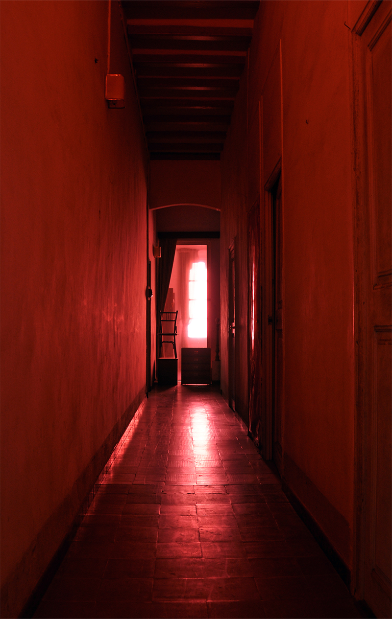
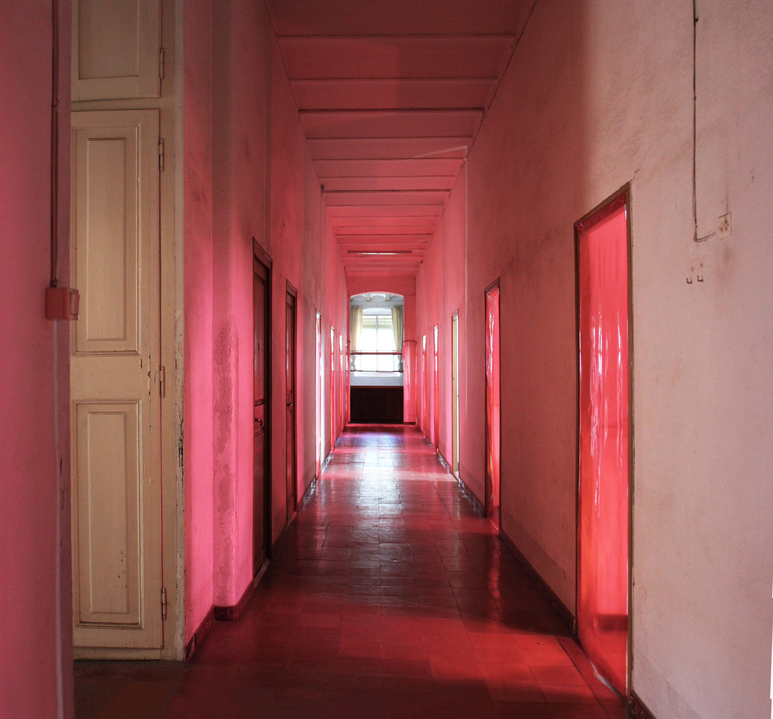
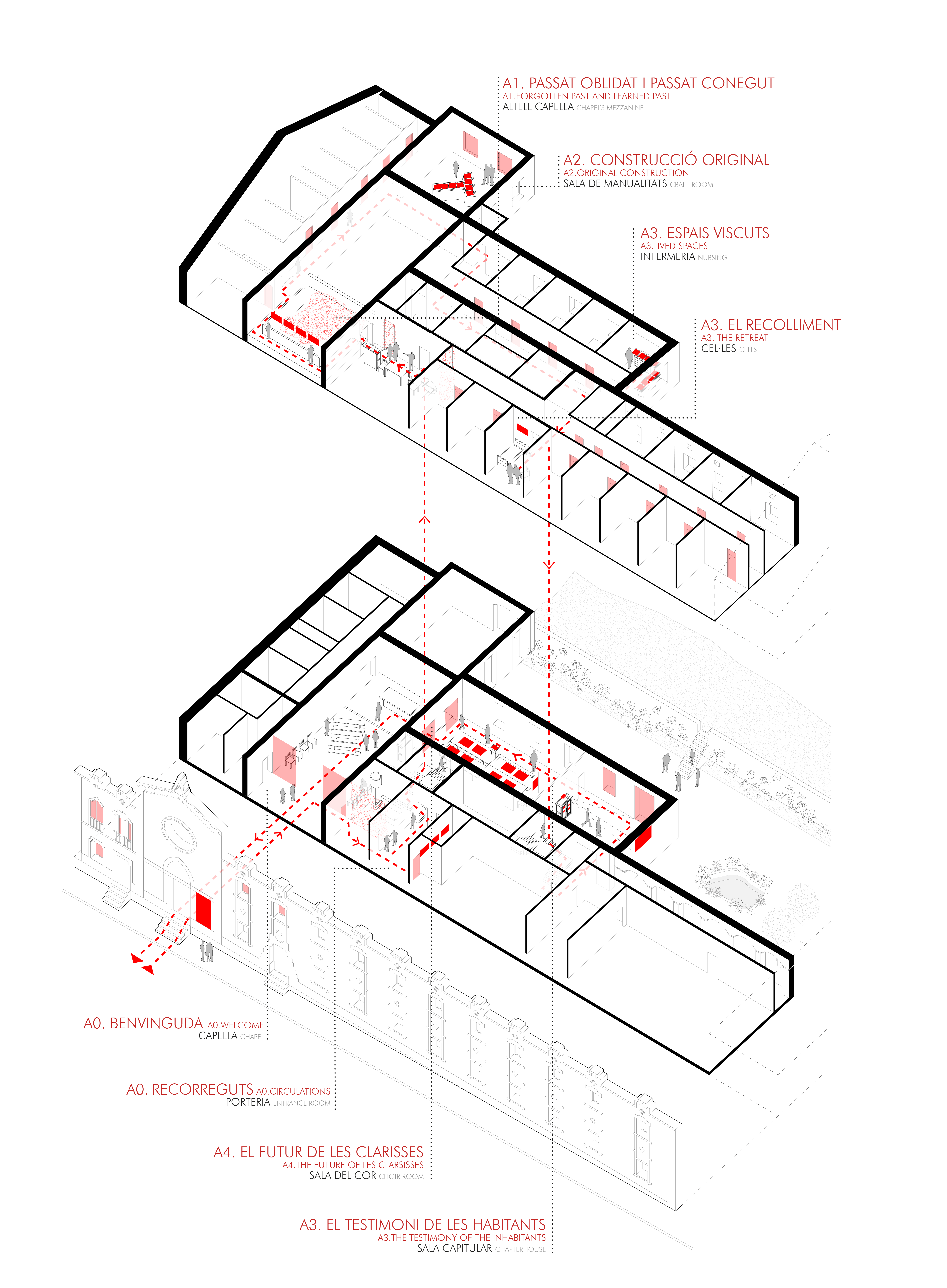
The assignment was a small format exhibition to be located in the church of the monastery but the proposal became more ambitious. The idea was to offer a guided tour by the musealisation of the building. The strategy consisted of selecting the most interesting and iconic spaces of the monastery in order to display the exhibition documents while experiencing the silence and mysticism that the monastery emanates. The space became the content itself. We used red as a tool to identify the exhibition spaces and circulations which is a color that stands out in contrast to the existing space. It transformed the empty white rooms into interesting eye-catching spaces.
The limited budget required cost-effective solutions. We created the exhibition supports by using existing furniture that was slightly adapted and therefore we strived to keep the intervention waste-free. For instance, an old window and its shutters were used as a cabinet for delicate original documents. Once this was solved, we could use the rest of the budget for printing the graphic material. The rest was invested in translucent plastic sheets and red tulle that allowed us to transform the space.
- Team: midori arquitectura and Marc Duatis
Musealisation
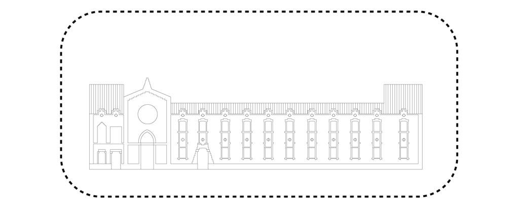
SPACE AND CONTENT
The existing building starts being the space for the exhibition and it ends up becoming the content itself. The musealisation opens the possibility of showing the iconic spaces of the old monastery.
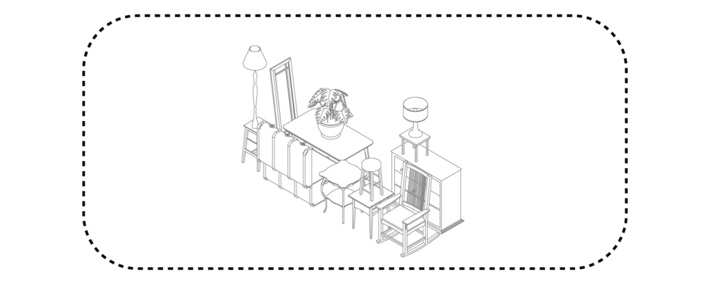
RECOVERED ELEMENTS
Some furniture and old objects are used as exhibiton supports and also to guide or block circulation spaces.

SPACE TRANSFORMATION
Transparent red plastic and tulle are used to modify the light color which defines the exhibition areas.
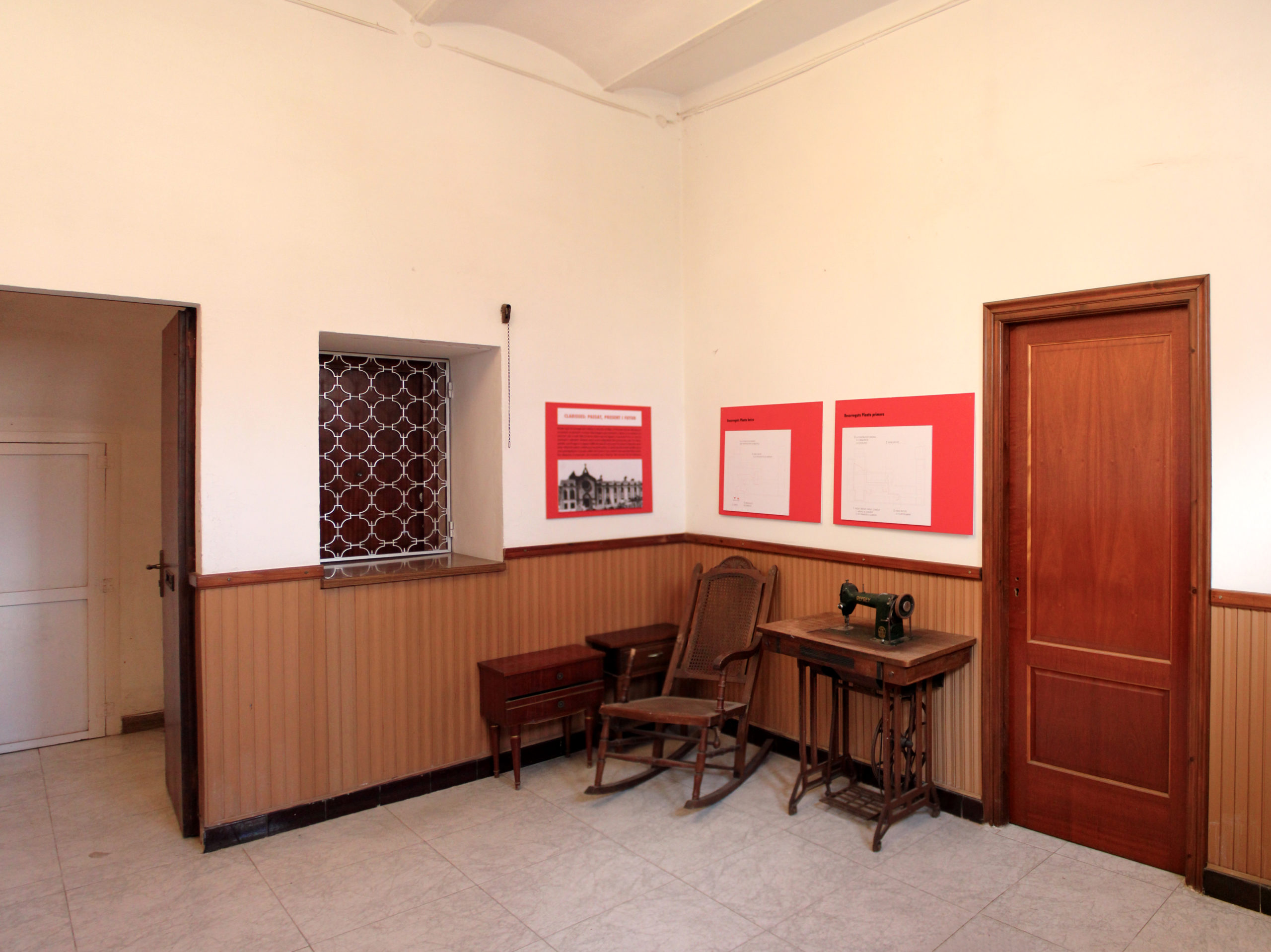
The access is the most known space of the monastery.
The grille was the window that made the communication between nuns and citizens possible.
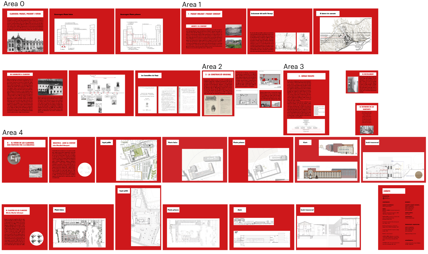
Contents
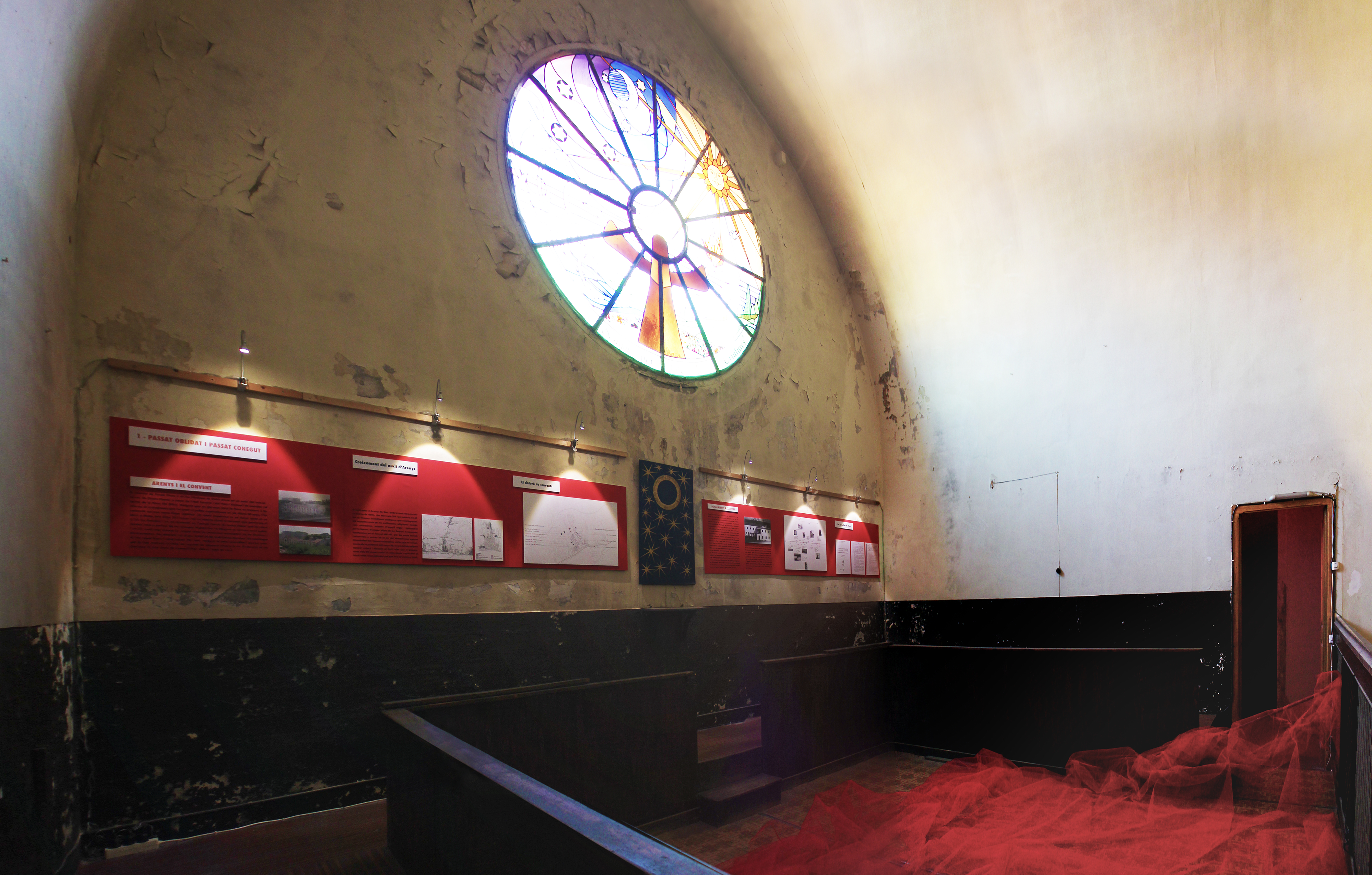
The mezzanine of the church where the choir used to be is the space in which the past of the monastery is explained.
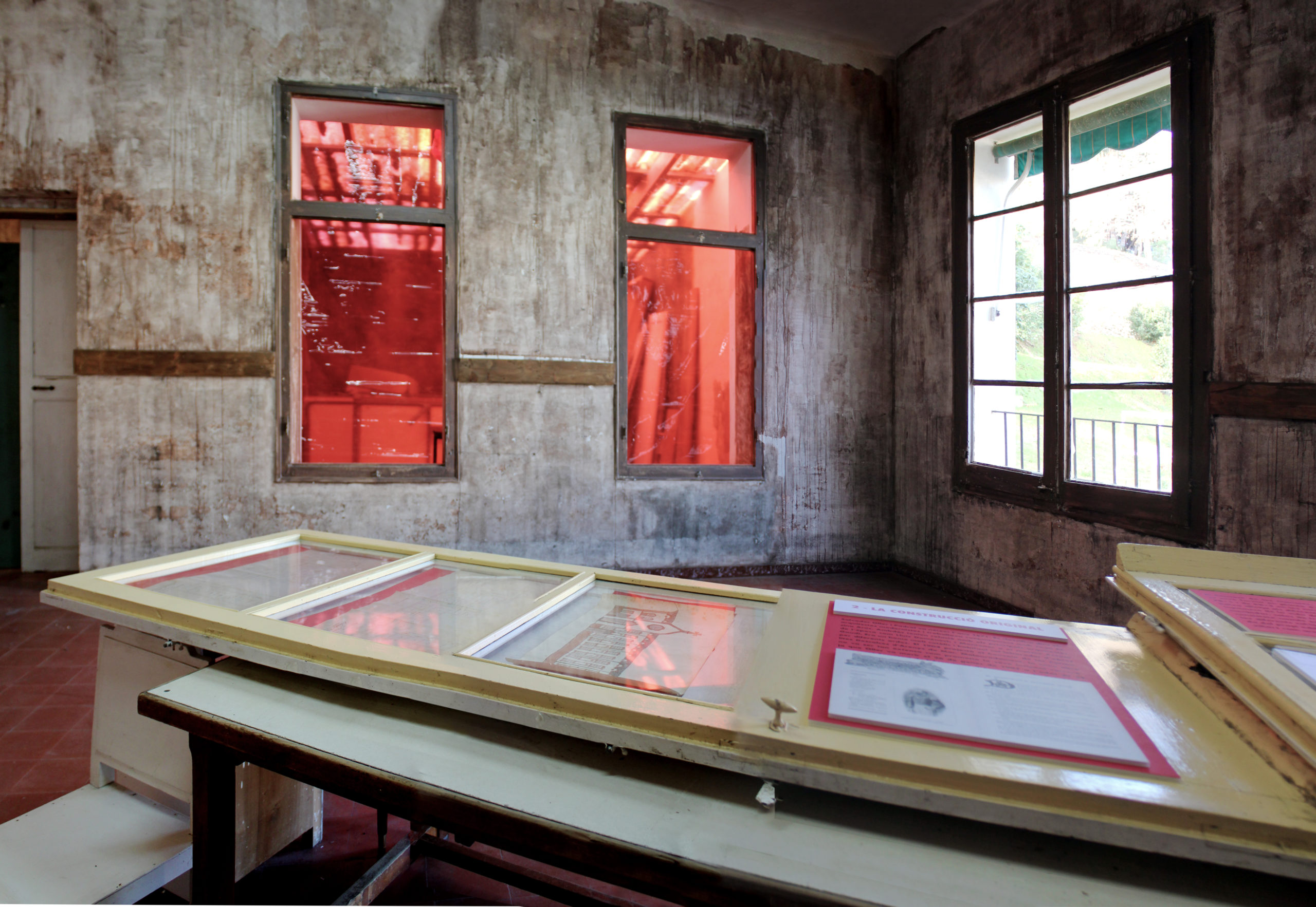
Some old windows and their shutters are used in order to show and protect the original floor plans from 1905.
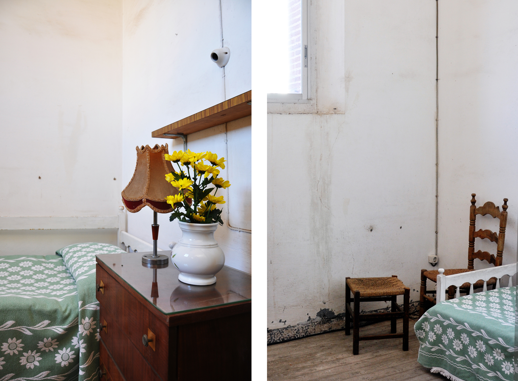
Some furniture is recovered to show how nuns were living in their bedrooms.
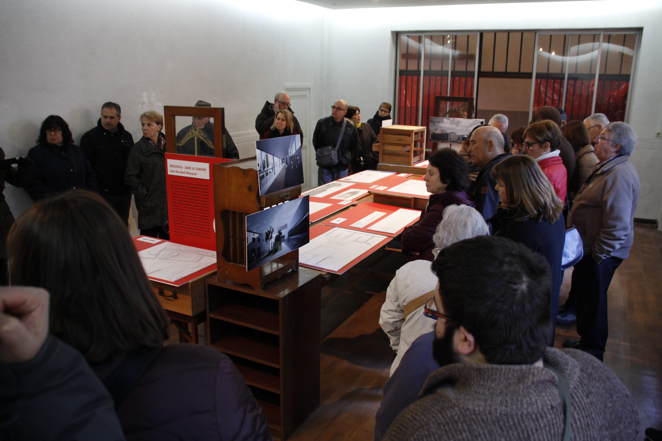
At the end two academic proposals show the possible future for the monastery. Photo: Xavi Salbanyà
On the 11th February 2018, the National Spanish Television (TVE) spent some time talking about this exhibition.
(In Catalan. English subtitles coming soon)
